


Workshop Brief: Typography
February 7, 2014 § Leave a comment
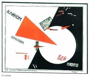
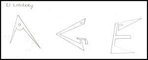
El Lissitzky

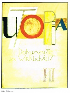
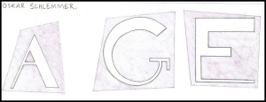
Oskar Schlemmer

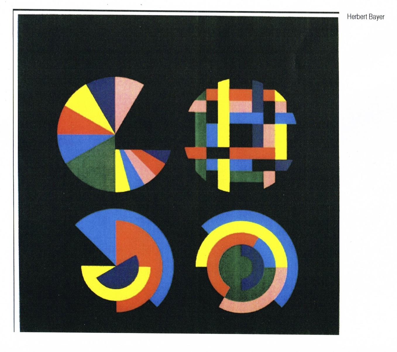
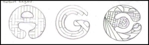
Herbert Bayer
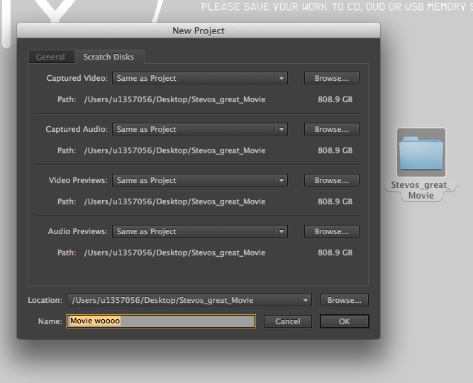
CHOSEN TYPOGRAPHY FONT TO DEVELOP:
Oskar Schlemmer influenced font style.
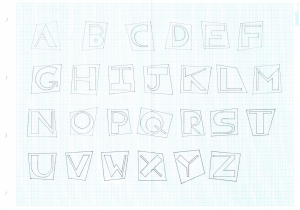
This is the typeface identity that I have created from the influence of Oskar Schlemmer’s work.
Voyager 1 Humanity’s Farthest Journey
February 4, 2014 § Leave a comment
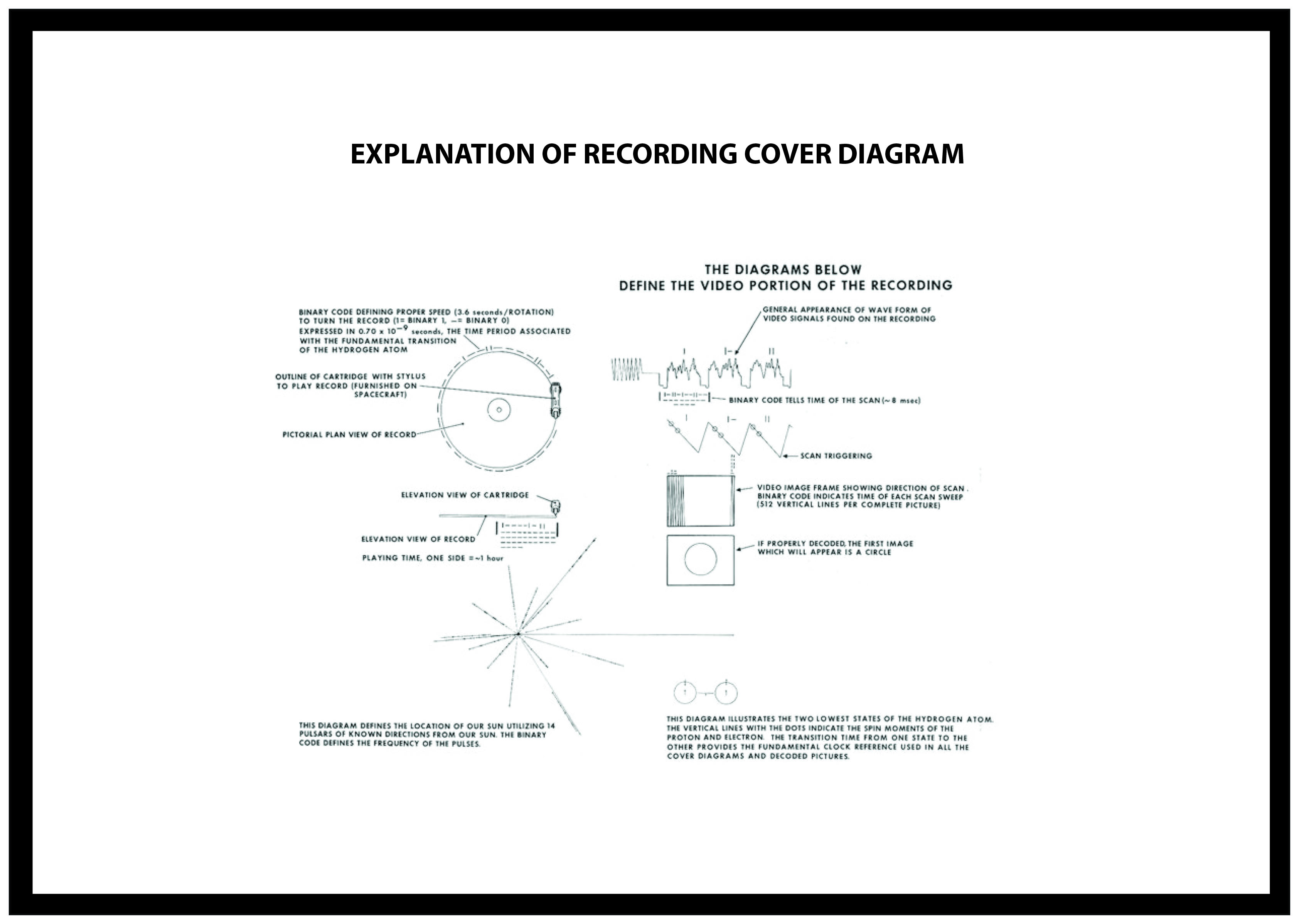
In the upper left-hand corner is an easily recognized drawing of the phonograph record and the stylus carried with it. The stylus is in the correct position to play the record from the beginning. Written around it in binary arithmetic is the correct time of one rotation of the record, 3.6 seconds, expressed in time units of 0.70 billionths of a second, the time period associated with a fundamental transition of the hydrogen atom. The drawing indicates that the record should be played from the outside in. Below this drawing is a side view of the record and stylus, with a binary number giving the time to play one side of the record – about an hour.
The information in the upper right-hand portion of the cover is designed to show how pictures are to be constructed from the recorded signals. The top drawing shows the typical signal that occurs at the start of a picture. The picture is made from this signal, which traces the picture as a series of vertical lines, similar to ordinary television (in which the picture is a series of horizontal lines). Picture lines 1, 2 and 3 are noted in binary numbers, and the duration of one of the “picture lines,” about 8 milliseconds, is noted. The drawing immediately below shows how these lines are to be drawn vertically, with staggered “interlace” to give the correct picture rendition. Immediately below this is a drawing of an entire picture raster, showing that there are 512 (29) vertical lines in a complete picture. Immediately below this is a replica of the first picture on the record to permit the recipients to verify that they are decoding the signals correctly. A circle was used in this picture to ensure that the recipients use the correct ratio of horizontal to vertical height in picture reconstruction.
The drawing in the lower left-hand corner of the cover is the pulsar map previously sent as part of the plaques on Pioneers 10 and 11. It shows the location of the solar system with respect to 14 pulsars, whose precise periods are given. The drawing containing two circles in the lower right-hand corner is a drawing of the hydrogen atom in its two lowest states, with a connecting line and digit 1 to indicate that the time interval associated with the transition from one state to the other is to be used as the fundamental time scale, both for the time given on the cover and in the decoded pictures.
Where are the Voyagers in interstellar space?
February 4, 2014 § Leave a comment
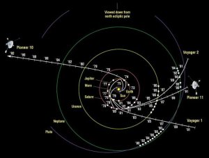
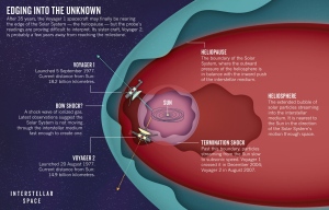
The Picture above shows us where the Voyagers 1 and 2 are in interstellar space. The twin Voyager 1 and 2 spacecraft continue exploring parts of space atmosphere where nothing from earth has gone before. In the 34th year after both there launches, they are bother much further away from Earth and the Sun than Pluto. Voyager 1 and 2 are now in the “Heliosheath” – the outermost layer of the heliosphere where the solar wind is slowed by the pressure of interstellar gas. Both spacecraft are still sending scientific information about their surroundings through the Deep Space Network (DSN).The primary mission was the exploration of Jupiter and Saturn. After making a string of discoveries there — such as active volcanoes on Jupiter’s moon Io and intricacies of Saturn’s rings — the mission was extended. Voyager 2 went on to explore Uranus and Neptune, and is still the only spacecraft to have visited those outer planets. The adventurers’ current mission, the Voyager Interstellar Mission (VIM), will explore the outermost edge of the Sun’s domain. And beyond. http://voyager.jpl.nasa.gov/mission/index.html
Earth Artifact – Road Map
February 4, 2014 § Leave a comment
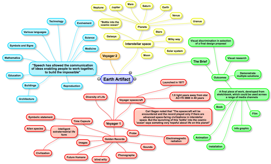
This is my ‘Earth Artifact’ road map. This is so far all the information that I have gathered about ‘Earth Artifact’ as a brief. This road map also shows the different directions that I could possibly go with this project in terms of media and substance.
Adobe After Effects Tutorial: 12 Principles of Animation Pt 1
January 27, 2014 § Leave a comment
During this Adobe After Effects tutorial we will be learning about the 12 principles of Animation/Motion graphics.
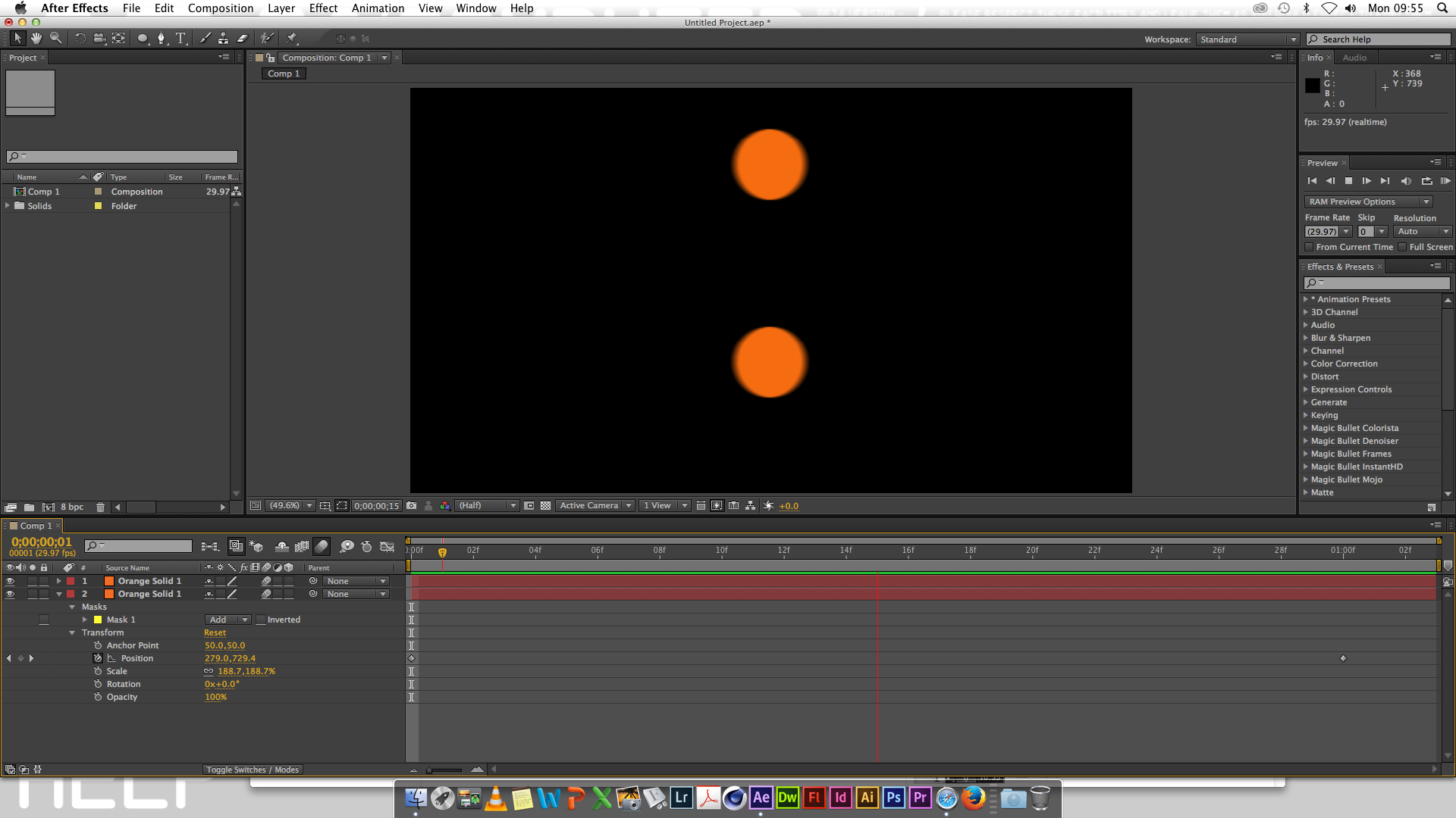
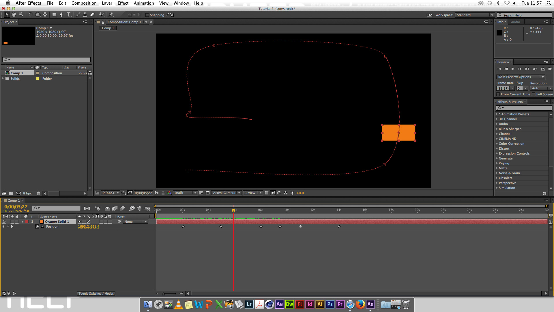
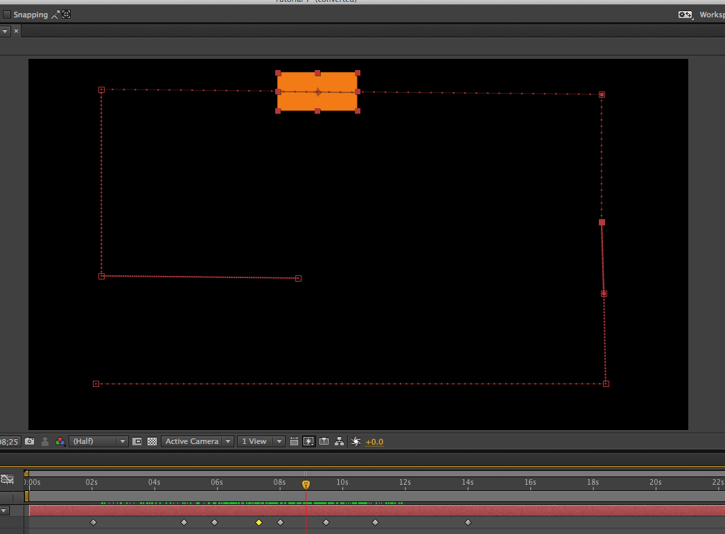
Firstly I started off with a blank composition in which I created a ‘new solid layer’ onto. I then pressed the P button and this twirled down the stop watch icon. I then clicked the stop watch icon to activate it. I then held down the ‘shift’ key and dragged down the solid layer so that it would create a position movement animation. This is showed a dotted line between where the solid layer was and where the solid layer now is. These its represent how many frames there are between the two keys, from the creation of this simple animation it shows two elements. This is that all animations are about timing which can be altered by increasing and decreasing the distance between the number of frames used in the time line. Time is represented by the spacing between the dots on the line of the animation movement between two keys.

This diagram on top shows the information about timing spacing and easing between keys on an animation.

During the screen shot on top we were shown the difference between normal key frame movement settings and then the change in time and movement of the individual solids when the key frame assistant was changed to ‘easy in’ or ‘easy out’ and the other options of movement between key frames.
We then moved onto the animation stage where we got taught the significance of timing and spacing in animation, as well as adding effects to the animation. These techniques were said to be the 12 principles of animation. I agree with this statement because timing and spacing techniques are the single most important things to consider when creating an animation in Adobe After Effects. Knowing these principles and the techniques in practicing these principles is very important when creating an effective animation where the designer is trying to be time efficient as possible. Knowing these principles will save the designer time and effort, however without relevant experience the designer will firstly have to do with trial and error to get the gist of how timing and spacing works.
Earth Artifact: Research – Vsauce Voyager 1 Contents
January 27, 2014 § Leave a comment
I have been watching Vsauce videos for quite a while now. Our new studio brief is about ‘Earth Artifacts’ and mostly regarding the disc that was sent up into space on Voyager 1. In this Vsauce video called ‘Lonley’ Michael Collins explains the contents of the disc and the deep meaning behind one of the chosen songs that is in the disc. This song is sang by Blind Willie Johnson “Dark was the Night, Cold was the Ground”. This song was chosen to represent ‘loneliness’ to extraterrestrial life.
My Manifesto: ‘I am for a design that is…’
January 27, 2014 § Leave a comment
In the graphic design in context lecture, we looked up Claes Oldenburg’s manifesto ‘I am for an Art…’ (1961). We were set the task to create our own manifesto in this style. Here is my own manifesto ‘I am for a design that is…’.
I am for a design that is aesthetically pleasing to the eye. I am for a design that is intriguing, that which raises questions and opinions. I am for a design that is informative, selective and meets its purpose. I am for a design that is imaginative, unique and creative. I am for a design that is suited to its proposed audience. I am for a design that is well organised and has excellent composition. I am for a design that elevates the mind into thinking. I am for a design that raises awareness.
I am for a design that is colourful, bold and eye catching. I am for a design that is easily understood. I am for a design that is complicated. I am for design that has multiple meanings. I am for a design that promotes peace. I am for a design that changes the viewer’s perspective. I am for a design that creates discussion. I am for a design that leads the way. I am for a design that starts a new trend.
I am for a design that is sophisticated. I am for a design that is elegant. I am for a design that is symmetrical. I am for a design that creates its own identity. I am for a design that breaks rules. I am for a design that follows trends. I am for design that is futuristic. I am for a design that adapts and evolves over time. I am for a design that makes history.
I am for a design that is a mere accident. I am for design that is contemporary. I am for design that is symbolic. I am for design that has subliminal messages. I am for design that stimulates the mind to think in such a way. I am for a design that uses psychology to manipulate the proposed audience. I am for a design that has a deeper meaning. I am for a design that is secretive. I am for a design that is simple yet very effective in portraying its message.
I am for a design that carries a story line. I am for a design that shows culture and identity. I am for a design that is straight to the point. I am for a design that maintains the viewers interest. I am for a design that has hidden adult humor. I am for a design that confuses the viewer. I am for a design that is stuck in the viewer’s thoughts all day.
I am for a design that brings back memories. I am for a design that is inspirational. I am for a design that becomes iconic. I am for a design that is a personal response. I am for a design that is expressive. I am for a design that promotes equality. I am for a design that is supremely powerful. I am for a design that is simplistically clever. I am for a design that kills two birds with one stone. I am for a design that is the beginning of a new era. I am for a design that is the designer.
Workshop Brief Research: Se7eN Typography
January 27, 2014 § Leave a comment
On our first day back from the Christmas holidays, we were given a new workshop brief on ‘typography in graphic design’. Our tutor asked us to watch a video clip showing just the opening tittle sequence from the 1995 film Se7en. Therefore I went home and watched the whole movie.
After watching the movie I think I understand the importance of letterforms much more and the deep identity a font style can have to represent a movie theme or a personality of a character. The film shows the passion that a person can have for what they do. The murderer in the movie tortures sinners, as he believes that this is his purpose. The murderer is very educated with a good academic background. He is always one step ahead of the detectives investigating the case, to the point where he chops off a detectives wife’s head off so that the detective would kill him rather than put him in prison. Overall I enjoyed the plot of the movie.
Adobe Illustrator Tutorial: Marilyn Monroe (Vector drawing steps)
January 23, 2014 § Leave a comment
-

- ………
-

- ………


Workshop Brief: Info Graphics – Graphical CV
January 19, 2014 § Leave a comment
For this workshop brief we was set the task to create a ‘Graphical CV’ which represented family, friends and their significance on our lives on a time scale.
-

- This was my first step, here I had started to create the time line, the X and Y axis.
-

- I then used the type tool to add the numbers required on the time line.
-

- After which I evenly spaced out the numbers in the correct order. This bottom time line shows my age from 1 to 19 years old.
-

- I then began to create my ‘Key’ this is where all the information for the coloured lines would be kept to easily identify the meaning and purpose of a colures line.
-
- I then decided that I would create two different Graphical CV’s for different groups of people, such as ‘family’ for one group and ‘friends/teachers through education’ for another group.
-

- This was my finished Graphical CV’s for ‘Family’ and ‘Friends/Teachers through education’. I used a significance rating of ’20’ on this Graphical Interpretation. However I decided that a significance rating out of 20 was too high, so I halved the rating axis.
-

- This is my finished outcome of my Graphical CV, this shows the key to both Graphical CV’s and has also been improved to a lower ‘significance rating number’ of 10.

After Effects Tutorial: Page Turn / Motion Blur
January 19, 2014 § Leave a comment
PAGE TURN:

MOTION BLUR:

Workshop: Escher Tessellation ‘CUTE to UGLY’ Transformation
December 23, 2013 § Leave a comment
This video was shown to us in our workshop. I found this video very amusing, this is because I’ve always had thing for mathematical graphics. Such as symmetry.
This is the YouTube tutorial link that was provided on our workshop brief for this task. I watched the whole video and then used the instructions given in the video tutorial, to create my own ‘Escher Tessellation’.
-

- STEP 1: following the YouTube tutorial

-

- STEP 2: scanning in the drawn outline of the tessellation’s shape into Adobe Photoshop CC.
-

- STEP 3: filling in the shape using the ‘Bucket too’
-

- STEP 4: copying the first layer, so that the shape can be tested to fit inside each other.

-

- YouTube tutorials outcome of the Escher Tessellation.
-

- STEP 5: starting working on the transformation from the word ‘CUTE’ to ‘UGLY’.


-

- STEP 6: draw ‘CUTE’ features onto the template of the top shape, and then duplicate this layer to the rest.


-

- STEP 7: draw ‘UGLY’ features onto the bottom template, and then duplicate onto the rest of the bottom templates.
The gallery above shows the steps that I took in order to achieve my final transformation from ‘cute’ to ‘ugly’.

This is my final ‘Escher Tessellation transformation’ from ‘cute’ to ‘ugly’. I am very pleased with this outcome, as I have spent a lot of time creating this transformation piece. Furthermore I have learnt a lot from the experience of producing this. Mostly about the rules of ‘Escher Tessellations’ and the mathematics behind it. I think this transformation is visually intriguing and mind puzzling for viewers, questioning as to how the transformation works.
Related articles
- Tessellations (emilyjanearnold.com)
- Tessellation Shader Generates No Output! (opengl.org)
- Effervescent – Bubble, Bubble, Toil and Trouble… (christinariverascott.wordpress.com)
- Regular Division of the Plane V by M.C. Escher 1957 (gracepage.wordpress.com)
- Maurits Cornelis Escher (artchatterblog.wordpress.com)
- Tessellations (creativitytoday.wordpress.com)
- Description and Critical Evaluation of an Historic or Contemporary Piece of Graphic Design (charlieabbas.wordpress.com)
- Mathematics in Art: Dali and Escher (rebeccajlindley.wordpress.com)
- Math project: Tessellation (thehomeschoolhangout.wordpress.com)
Story / Article: Grid layout and outcome
December 12, 2013 § Leave a comment

For our story/article we used the grid layout guide to help us position images and text boxes from our thumbnail ideas. This is so that we could see how our story/article would look with real text and images, along with the typography that we might use. Also I placed my real subheading headlines into the boxes to get a real representation.
This was one of my small thumbnail design that I decided to represent with more detail. I have done this by using a real typography style for the main headline and real subheading text that would be in place, along with images to represent how big they would be and where they would be placed.
Related articles
- Newspaper Article Layout (skodeegibson.wordpress.com)
- Story / Article Layout Thumbnails (monirkhanblog.wordpress.com)
- Grid Layouts (samanthajaynebutler.wordpress.com)
Joseph Cornell: Worlds in a box video
December 10, 2013 § Leave a comment
This is a video we watched on a artist who is well known for his ‘worlds in a box’ work (cabinet of curiosities). From watching this video and looking at his previous work, i’ve got an understanding of the type of primary research that I will be carrying out. Such as, I will be visiting antique shops to photography old cabinets and boxes and also the type of items that might be placed in the box. This is a very broad research on the theme, so that I can get a better idea of the type of material I will be looking at during this brief.
Watching this video has allowed me to gain deeper knowledge about the brief. Joseph Cornell did not merely insert random found objects into his boxes, he used materials that had a strong meaning which the viewer wouldn’t necessarily understand why its there just by looking at it, and this is what caused viewers to be attracted to his work, because of the curiosity it caused.
Related articles
- cabinet of curiosity – artist research (jablesmegee.wordpress.com)
- The Cabinet of Curiosity: Joseph Cornell (siiengfung.wordpress.com)
- The Cabinet of curiosity (alexandrospapantoniou.wordpress.com)
- Cabinet of Curiosity #4 (cjlsketch.wordpress.com)
- Cabinet of Curiosity (jonnybate.wordpress.com)
- Cabinet Of Curiosity (klaudia699.wordpress.com)
- Assessment Brief- The Cabinet Of Curiosity (andrewedwardfish.wordpress.com)
- Joseph Cornell Research (samanthajaynebutler.wordpress.com)
- Cabinet of Curiosity (samanthajaynebutler.wordpress.com)
Adobe InDesign: Tutorial 3 basics
December 9, 2013 § Leave a comment

In our third InDesign tutorial we were taught how to move text along columns by simply selecting the text column and then dragging it to the desired place.

We were then showed how to use the master page function. To do this we were told to click on the pages tab on the top right hand side. We then selected the master page and then placed an image, because we placed the image on the master page, every other page also had this image. This is the great thing about the master page, you can use it to save time. For example if every page on your publishing design is meant to have logo, you can save time by using the master page.
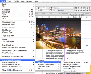
We were then taught how to number all the pages. To do this we were told to type ‘page 1’ on a random page and then click on the ‘type’ tab and then select ‘insert special character’ then ‘markers’ and then the ‘current page number’ option. By doing this, InDesign automates the page numbers, saving the designer time and confusion with huge number of pages that a designer could be working on.
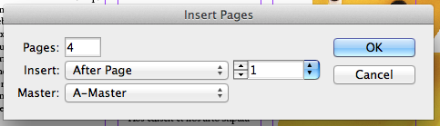
We then learnt how to add more pages, as well as adding a ‘master page’. Having the choice of more than one master page means that you can present clients with various different types of logo positions or contact information.
I have learnt some important time saving features of Adobe InDesign in the tutorial that I feel will be very helpful to me in the future if I was to use InDesign to create a piece of text based work.
Related articles
- InDesign Tutorial 4 (tommstephenson.wordpress.com)
- Adobe InDesign Tutorial – Basics (ashermoss.wordpress.com)
- Adobe InDesign: InTro (Mondays) (mateydevedzhiev.wordpress.com)
- Adobe InDesign. (jakehow1312799.wordpress.com)
- Adobe InDesign Tutorial | Mater Page (lorenzduberry.wordpress.com)
- Adobe Indesign Tutorial (jordanhayton.wordpress.com)
- Using Adobe InDesign (claydohh.wordpress.com)
Physical Secondary Research: Collage
December 9, 2013 § Leave a comment

This is a collage that I have produced using only secondary images from magazines, newspapers and booklets. I have thoughtfully considering the images that I have included in my collage as well as text. Keeping in mind that this was physical graphic research for my “Cabinet of Curiosities” brief.
I think I have done this well, and have used a variety of in depth thought out images to represent my projects theme in a graphical form.
Related articles
- Collage (itsliamrose.wordpress.com)
- Cabinet of Curiosities (sismeyb.wordpress.com)
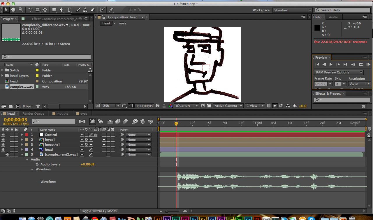
Adobe After Effects: working with sound and animation
December 9, 2013 § Leave a comment
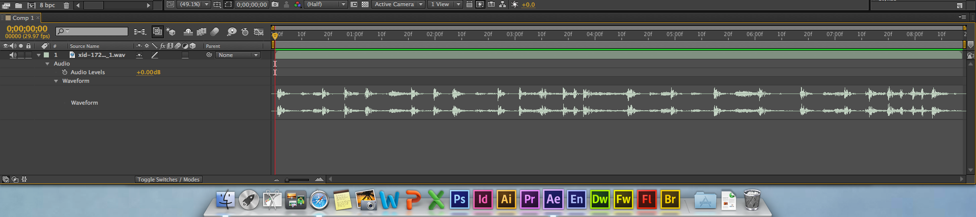
In this tutorial we first imported a sound file (WAV) into Adobe After Effects and then our tutor showed us how to get a graphical view of the sound. We then cropped the time line to the length of the sound file, as we were going to work around the sound.

Our tutor then showed us how to add markers to the time line by pressing ‘command and 8’ however this only added markers to the time line and not the sound file. This meant that if we moved the file along the time line then the markers would not move with it. So for that reason we selected the sound file and pressed ‘command and 8’ on the areas of the sound file we wanted to make a mark on. Also we was taught that we could name each of our markers by ‘alt’ clicking on it, I think this is very important function and I can see the many possible uses for this function. This is something that I have learnt new and I think this will be very useful to me in the future.

We were then told to create a solid white layer and to place it on the left corner. We then created keyframes for shapes movement across the composition, same process as to the tutorial we did last week. We then changed the keyframe interpolation to linear so that the movements became straight along the line, rather than curved lined movements. Once we had done this, the shape would then move to beat, we had to press the play button on the right hand side. This is because space bar moves the solid along the keyframes created and ‘full stop’ plays the sound file.
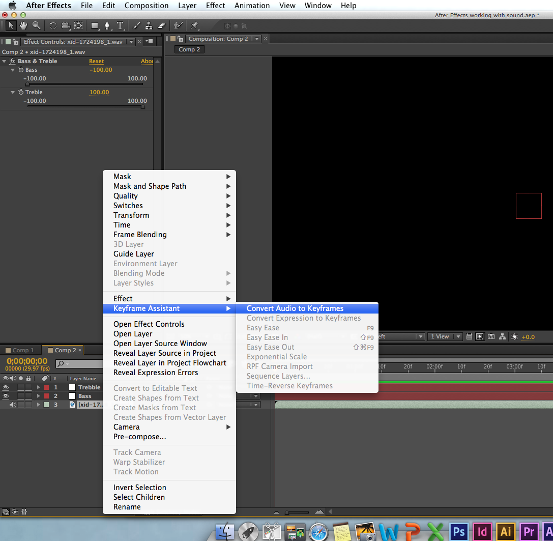
As you can see from the screen shot above, to connect the sound file to the solid layers keyframes we had to use ‘keyframe assistant’ this allowed us to convert the audio to keyframes.

We then made new layers using the ‘bass and treble’ of the sound file. So for one layer we put the bass down fully to zero and put the treble up to full and then saved this as a new layer. We then did the opposite by putting the treble down to zero and putting the bass up full, with this we created a new layer too. We now had to different beat styles to work with animation.
We were then taught to put a stroke animation onto the bass of the sound file. We selected the stroke tool and set this to 10. We then linked the bass file and the stroke effect together to create an animation. By pressing the ‘U’ key when my solid layer was selected it twirled down all the properties of the bass sound layer. We then linked the pick whip tool to both channels of the bass layer.

This was the finished look of my sound file animation. I added some text to the animation, this is was something that I learnt from an earlier tutorial.
This is my finished sound animation, I think this is very useful information that we have learnt.
Related articles
- Adobe After Effects Tutorial – Sound (andmak12.wordpress.com)
- Adobe After Effects – Sound (rahulkarara.wordpress.com)
- Adobe After Effects- Sound (jordanhayton.wordpress.com)
- Adobe After Effects Tutorial | Animation With Sound (lorenzduberry.wordpress.com)
- Sound on After Effects (lucyxwalker.wordpress.com)
- After Effects Tutorial: Animating a ‘Paper-Folding’ Effect (shutterstock.com)
- After Effects: Sound (mark1moore1.wordpress.com)
- Sound in After Effects (tomlucasdav.wordpress.com)
- After Effects Tutorial – Sound (sophiestrain.wordpress.com)
Adobe After Effects: Keyframes and Pre-comps
December 6, 2013 § Leave a comment
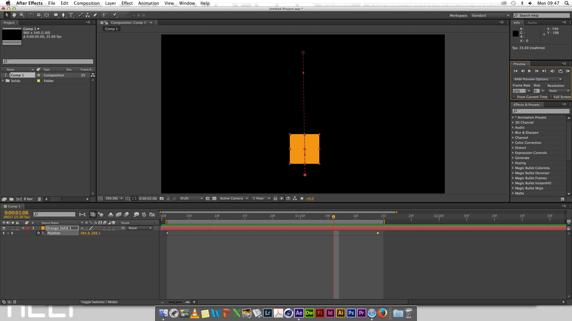
In this tutorial we were firstly taught how to make ‘keyframes’. To do this we selected out orange coloured solid and then pressed ‘p’ for position and clicked on the stop watch icon. After which we started making our keyframes by moving the solid shape right whilst having the ‘shift’ key pressed (this kept the movement constrained to being a straight line). We repeated this process for every different directional movement. This is how keyframes were created.
We was then told that Adobe After Effect by default makes the movement smooth by creating curved lines. So therefore to remove these curved lines and straighten them, we were told to ‘right click’ and select the ‘keyframe interpolation’ and then change the middle drop down menu to ‘linear’. This turns the curved lines straight, you can see the difference from the first two screen shots.

We were then showed how to turn these straight keyframe lines curved again. To do this we were told to select each point of directional change and then using the ‘handles’ shown, move them to adjust the amount of curved required. This then allowed us to join the curves round to the first ‘keyframe’ and therefore the solid would move all the way around the oval shape created. To play out the keyframes movement we would press the ‘space bar’ key.

The screen shot above shows the finished piece of the next part of the tutorial. For this next part we were told to make a new composition and then to create a new solid. I made the solid a small square at 0 seconds and a bigger square at 2 seconds. When played back this would create the effect of the square getting bigger over time. I then changed the ‘keyframe assistant’ to ‘easy easy’ this changed the speed rate to which the square changed its size making the playback more gradual rather than sudden.
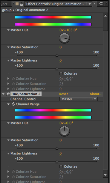
I then duplicated that solid by selecting it and then pressing ‘command and D’ together. I then clicked on the colour adjustment tab on the right hand side and then dragged the ‘hue & saturation’ effect onto the new duplicated layer. As you can see from the screen shot above, this then brought up the ‘hue and saturation’ tool tab. This allowed me to change the colour of the new duplicated solid.
![]()
We was then told to move the new duplicated shape forward on the time to about 1.0 seconds. We repeated this process another 4 times, however each time having the new duplicated shape to come appear on the ‘timeline’ at different times. We also changed the position of each duplicated solid with the ‘curser’ tool to different areas of the composition, along with changing the position we also rotated each individual duplicated solid. This allowed us to make distinctions between every shape, thus making every new duplicated solid different in colour, rotation and the position within the composition. This allowed the animation to be much more interesting in the most efficient way possible.

We then grouped the first set of differentiated solids along with the time line. After grouping these, we then duplicated the first group by selecting it and then pressing ‘command and D’. We then adjusted the size and rotation of the new group, then dragged the ‘hue and saturation’ effect onto the new duplicated group and changed the colours as much as we could to make it different from the original group. Thus allowing us to have a whole new group of solids that are completely different in size, rotation and colour from the original group of solids. Finally we repeated this same process once more, we then had our final finished animation piece.
This is my finished animation piece. In my personal opinion I have learnt so much from this tutorial about how Adobe After effect works and the functions, possibilities that are available from becoming skilled in using the software. I think that by learning the most efficient ways of creating animation pieces, it is enabling me to be the best graphical designer possible. I believe I am grasping a lot of skills and techniques from these tutorials.
Related articles
- After Effects: Keyframes & Pre-Comps (yahyadelair.wordpress.com)
- After Efects Software Tutorial – Keyframes and Pre – Comps (carbutt.wordpress.com)
- After Effects- Keyframes and pre-Comps (beckyboyesmajor.wordpress.com)
- After Effects: Keyframes and Pre-comps (andrewedwardfish.wordpress.com)
- After effects Keyframes & pre-comps (kirstyhumphries.wordpress.com)
- After Effects – Keyframes & Pre-Comps (Week 9) (gerardas94.wordpress.com)
- Keyframes & Pre-Comps in After Effects (tomlucasdav.wordpress.com)
- Ae Keyframes & Pre-comps (rahulkarara.wordpress.com)
Own work in the style of Richard Hamilton
December 6, 2013 § Leave a comment

I started my transcription of Richard Hamiltons work in my own style, by firstly choosing this image of a living space. I thought that this living room represented many of the living room living spaces of the modern day, therefore I thought it was very contemporary. Also I thought this living space would be perfect to work with.

I then added colour to walls, as coloured walls are something we are beginning to see more and more of in the modern day of interior design. Interior designers tend to use one wall in the living space as a ‘feature wall’ and this feature wall is usually the only different coloured wall in the living space. Therefore in my opinion I think that this represents contemporary living spaces much better.

This was my final outcome of my own work in the style of Richard Hamilton’s work. I have chosen every single item in the living space very carefully with a lot of thought as why and how it represents the modern day very strongly.
This workshop brief has allowed me to think deeply about the main issues and the items that have very strong representation of the modern era.
Related articles
- Richard Hamilton: Contemporary Re-Make Workshop (jessicalouisekenyon.wordpress.com)
- Richard Hamilton’s remaiking collage (alexandrospapantoniou.wordpress.com)
- Richard Hamilton (katiekershaw.wordpress.com)
- Richard Hamilton: A Contemporary Re-Make (benhendo.wordpress.com)
- 26.11.13 Contemporary Re make of Richard Hamiliton classic collage (jennamadden.wordpress.com)
- When London Went Pop! (aglaeas.wordpress.com)
- Richard Hamilton (namlloyd.wordpress.com)
- The Cabinet of Curiosity: Richard Hamilton Collage Begining (Tuesdays) (mateydevedzhiev.wordpress.com)
Caine’s Arcade: Cardboard Challenge
December 6, 2013 § Leave a comment
For this work shop brief we were told we could work in groups to follow Caine’s lead and design with ‘playfulness’ in mind or to build ‘something’ that conveys an emotion.
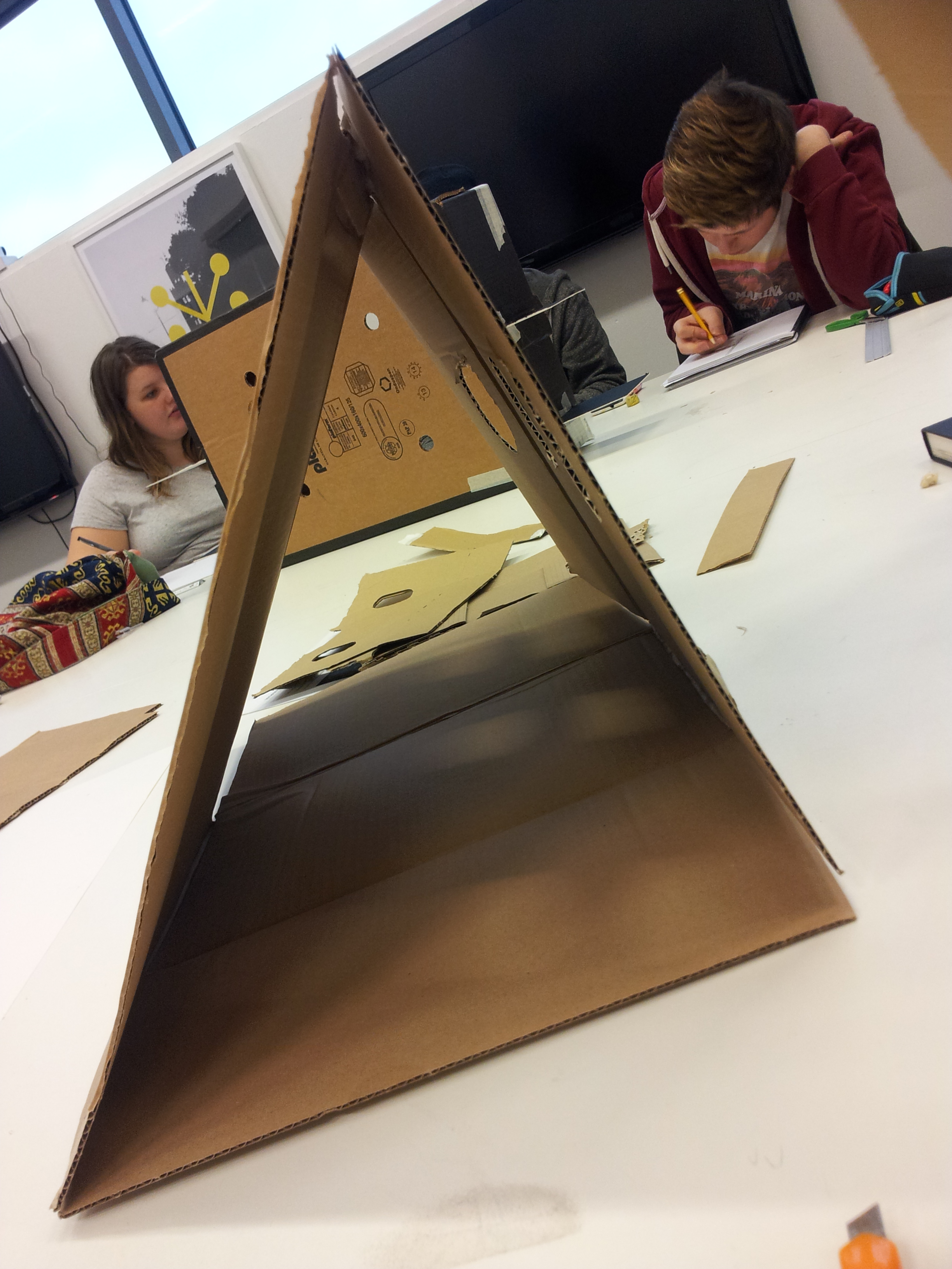
With the brief in mind I partnered up with Mij (emhaych.wordpress.com) and we came up with idea of creating a physical ball arcade game. To achieve this we used 3 big sheets of cardboard to create a triangular shape with a standing face that supports itself.

We then cut up three holes on the face of the shape, where players of this game would attempt to throw a small Pingpong into the holes for points. To cut out the shapes we used Craft Knifes and masking tape to hold the triangular shape together.
We then sparked up another idea to include a basketball style hoop to give players of this game various options to collect points. To achieve this we used another piece of cardboard to create a headboard where players of the game would use it as a rebound area to bounce the ball against and drop through the hoop. We also made some rectangle shaped holes at the bottom of the shapes face where the balls would come back out from, when a player scored.
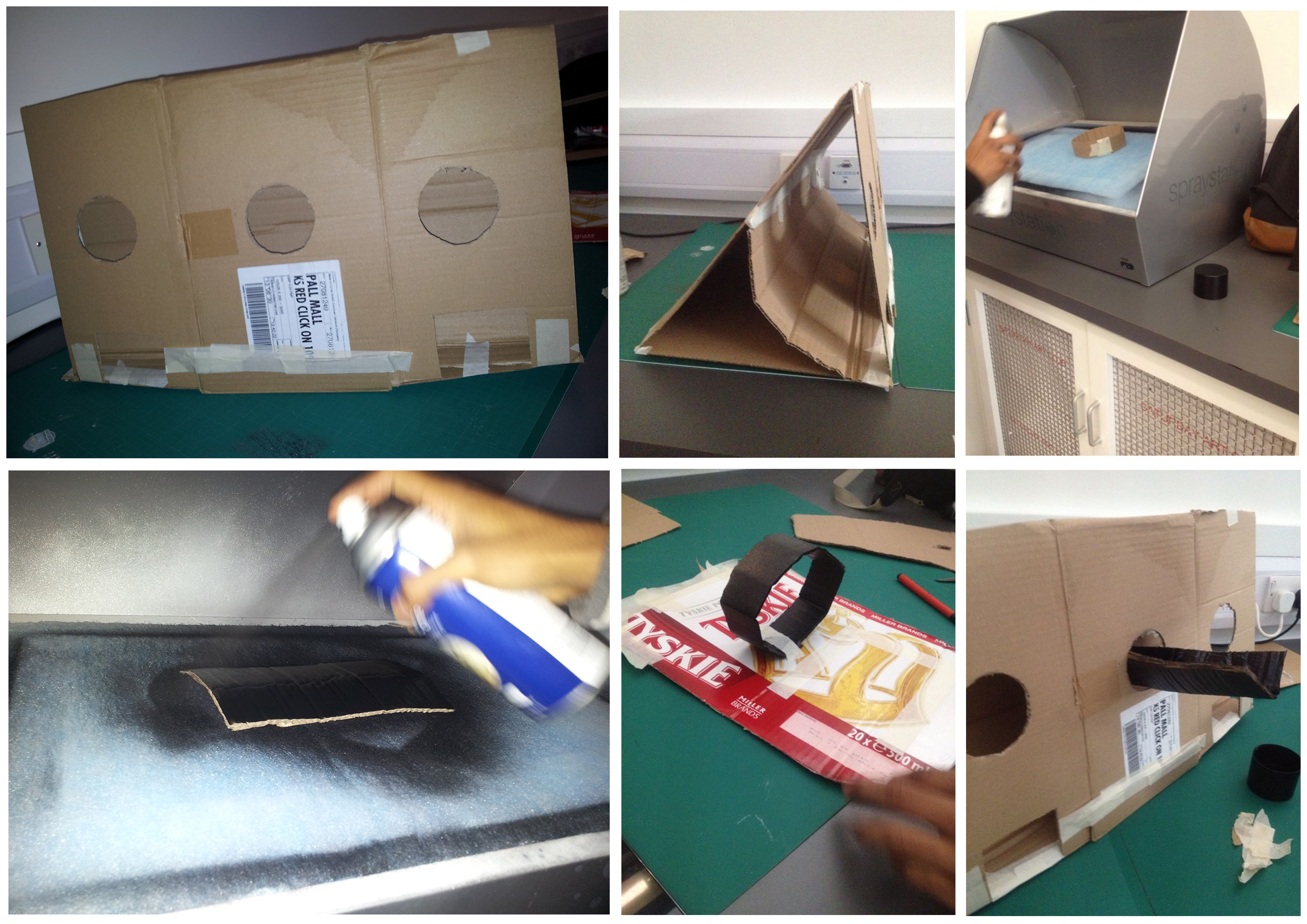
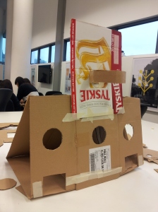
We then decided to spray paint our arcade game using the Universities ‘spray station’ , so that it looks more aesthetically pleasing and approachable by curious arcade gamers.

We used masking tape to cover up a square outline that would reveal itself after the masking tape had been taken off once the target board was spray painted. We then taped the target board onto the main triangular shaped body of the game, after which we then sprayed the whole arcade game once again.
I think that the sprayed outcome looks great, however we plan to add some markings onto the game. Such as the games name, score points and target outlining.
I have learnt a lot from this workshop, such as the amazing things that could be created with minimal resources and a lot of imagination and improvisation.
Related articles
- Caine’s Arcade – the cardboard workshop (matthewsgraphicsblog.wordpress.com)
- This Kid’s Got Game – Have You Heard About Caine’s Arcade Yet? (capitalogix.typepad.com)
- Workshop – “Caine’s Arcade” (jadussx.wordpress.com)
- Caine’s arcade! New task.. (christyconway.wordpress.com)
- Caine’s Arcade: Imagination Foundation Cardboard Challenge. (eleanorfayebaines.wordpress.com)
- 3.12.13 Caine’s Arcade (jennamadden.wordpress.com)
- ‘Caines Arcade’ Imagination Foundation Cardboard Challenge (siiengfung.wordpress.com)
- Workshop – ‘Caines Arcade’ Imagination Foundation (mraimond93.wordpress.com)
- Caine’s Arcade. The telephone box. (alexandrospapantoniou.wordpress.com)
- Caines Arcade-Imagination Foundation (piotr1532.wordpress.com)
InDesign: New document basics
December 5, 2013 § Leave a comment

In our first tutorial on Adobe InDesign, a creative software I’ve never used before. Our tutor showed all the key functions and abilities of creating a new InDesign document. Firstly he told us that InDesign was software for publishing, creating magazine articles, books and other text based documents. He also told us that with InDesign we are able to work with 999 pages as one file. However he advised us that its best not to do this as losing that one InDesign format file would mean losing quite a lot of work.
As you can see from the screen shot above there is a ‘intent’ drop down menu that enables you to choose the purpose of the document. For example if its being produced for a website then we would select the ‘web’ option or ‘print’ for general printing. Another function is the ‘facing pages’ option which is usually already selected by default, this allows you to work on two pages at the same time. This is usually used for a design that spreads across two pages, for example in the centre of newspapers where double pages are used for one advertisement. He also taught us that we could choose the number of columns we want our document setup to have on the ‘columns number’ option section. Furthermore if you click ‘more option’ this extends the window and gives us the ability to adjust the amount of ‘bleed’ we want our pages to have. This function is used for the purpose that once the document has been printed there is slightly excess space around the edges that could be cut off without losing content on the document.

We was also taught where and how the ‘type’ tool could be used within InDesign and how colour could be changed using the colour pallet. He also showed us how to use the ‘stroke fill’ which only fills the selected object in colour. For example the rectangle that we created using the ‘shape tool’. More to the point if the square behind the ‘stroke fill’ is clicked once this gives us the option to fill inside the object selected.
I think I have learnt a lot from this tutorial which will become very useful to me in the future. This is because text based documents are very popular. Also there are so many features and functions within InDesign that allows making text based document much more time efficient than using other softwares.
Related articles
- InDesign Tutorial: Basic Functions (monirkhanblog.wordpress.com)
- InDesign #2 (prayogishen.wordpress.com)
- Introduction to InDesign with George (taylornicolesim.wordpress.com)
- Using Adobe InDesign (claydohh.wordpress.com)
- 25.11.13 InDesign Tutorial Creating a Basic Document (jennamadden.wordpress.com)
- InDesign Tutorial- Basics (kirstyhumphries.wordpress.com)
- Introduction to InDesign #1 (prayogishen.wordpress.com)
- Week 8: Adding Text and Imagery to InDesign (abbielizabethbeach.wordpress.com)
“Cabinet of Curiosity” Road Map
December 5, 2013 § Leave a comment
This is the road map that I produced for my ‘Cabinet of Curiosity’ project brief. From reading the project brief I began to understand an idea of what subject area’s I need my road map to go through. Therefore by doing this I will have better insight into the subject area’s I could develop into a final outcome that reflects the briefs criteria.
Related articles
- Cabinet of Curiosity- “Mind Map” (beckyboyesmajor.wordpress.com)
- Cabinets Of Curiosity (lorenzduberry.wordpress.com)
- Cabinet of Curiosity #2 (cjlsketch.wordpress.com)
- Cabinet Of Curiosity (klaudia699.wordpress.com)
- The Cabinet of curiosity (alexandrospapantoniou.wordpress.com)
- Cabinet of Curiosities (sismeyb.wordpress.com)
- Cabinet of curiosity briefing (rachelcolleyblog.wordpress.com)
- ‘The Cabinet Of Curiosities’ (abbielizabethbeach.wordpress.com)
InDesign Tutorial: Basic Functions
December 3, 2013 § 1 Comment

In this InDesign Tutorial we were firstly taught how to create a simple 3 column layout. We was then showed how to place text into the page. To do this we selected the ‘file’ tab and then clicked on ‘place’ which allowed us to locate the text file that we needed to place. He showed us that clicking once onto the first column inserted only much of the text as it could fit into this column. This was indicated by ‘plus (+)’ sign at the bottom of the text, telling us that there was text still left to insert.
So therefore we clicked on the ‘plus’ sign and this allowed us to place some more of the text onto the next column and so on.

Our tutor then told us that this wasn’t the most efficient way of doing this as it could take forever for a long text based piece. So for that reason he showed us to ‘undo’ everything and ‘place’ the text file into the document again. However this time when placing the text to hold onto the ‘shift’ key and click once onto the first column. As you can see from the screen shot above, this automated the whole of text file into the columns efficiently.
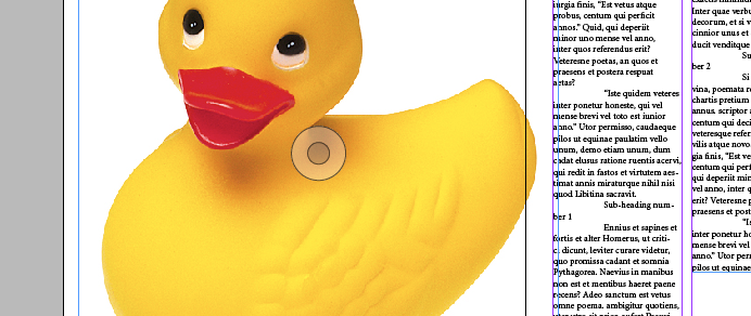
We was then asked to place an image onto the document. Again this was the same procedure, ‘file’ and the clicking the ‘place’ option. We was asked to place the Duck image onto the side workspace. The transparent circular icon is what allows you to move the image around in its own box.

I was showed how to create a box. To do this I selected the shape tool and marked out a square which I then filled with colour using the colour pallet. After doing this I placed the Duck on top of the solid square. This was because our next step was removing the white background from the Duck image. To achieve this we selected the ‘clipping path’ tool this allowed us to select the ‘detect edges’ from the drop down menu. Once this was selected, clicking ok removes the white background from the Duck.

Our tutor then showed us all the text and paragraph editing functions. Such as how the text always flows continously even if you create a gap for images. He also showed us how to make the first letter of any paragraph big to create emphasis to the first word.

We was then taught how to make text wrap around images. To do this we was told to click the ‘window’ tab and select the text wrap option. This little ‘text wrap’ window gave us a few options as to what we could do to manipulate how the text behaved around our Duck image. Once we had clicked on the first icon for the text to wrap around the Duck we noticed that some of the text was very close to the Duck. So to push this text further away we clicked the ‘up’ arrow to move the text slightly away at the top of the Ducks head.

Lastly for this tutorial session, we was taught how to place text within any desired shape we wanted. For example I used the pen tool to create the letter ‘M’ in which I was going to put my text in. To do this I clicked on the ‘file’ tab and then selected the place option. Once this window opened I selected the text file I wanted to use. I then clicked inside the ‘M’ shape and placed my text inside.
To create the first ‘M’ in which my text follows the shape that I’ve created using the ‘pen tool’. I clicked on the ‘Type on a path tool’, this then gave me a flashing curser on the path. This was the indication that text could now be placed on the paths shape. So therefore I followed the text placement procedure.
I think I have learnt a lot of useful information from this tutorial. This is because I have never used Adobe InDesign before, and I have always wanted grasp the skills and knowledge to use this creative software effectively.
Related articles
- InDesign Tutorial – Image and Text (jonnybate.wordpress.com)
- InDesign: Text and Linking To Graphics (mark1moore1.wordpress.com)
- InDesign: (Week 2) (ryanabbey.wordpress.com)
- Adobe InDesign: Text, Images and the Pen Tool. (benhendo.wordpress.com)
- In Design Tutorial- Text and images 02/12/13 (kirstyhumphries.wordpress.com)
- InDesign Week 2 (samanthajaynebutler.wordpress.com)
- InDesign Lesson Week 2 (georgemcguinness.wordpress.com)
- Using Adobe InDesign (claydohh.wordpress.com)
Story / Article Layout Thumbnails
December 2, 2013 § 1 Comment

For my story/news article I have sketched out detailed thumbnails. This is so that I can generate many ideas as to how my final layout of the story/news article would look. I have annotated each thumbnail design idea, dicussing what I like about the design and what I don’t like also what would work better. I have done this by critiquing the thumbnail designs.
In these thumbnail design ideas I have included where images would be placed along with any subheadings and text. I have done this by using distinctly bigger X’s to represent the title and slightly smaller X’s to represent the subheadings, Scribbly lines to represent the main story/article text. Also for the representation of the images I have used rectangle boxes with a small icon within it to represent an image. I think that these representational thumbnails of the news article/story layout have worked out really well. Firstly because my University tutor said so and secondly because I personally think that these thumbnails are well drawn out in detail and also easy to understand.
Related articles
- Week Three – Layout Thumbnails (carlalouisescarisbrick.wordpress.com)
- Week 4, Task 4: Layout and Thumbnails (andrewedwardfish.wordpress.com)
- Design Practice Two – Layout Thumbnails (u1362960hf.wordpress.com)
- Thumbnails for Layout (jennamadden.wordpress.com)
- Thumbnail layouts (The Kirkburton Fox) (gctgraphics.wordpress.com)
- Thumbnails & Layout (projectgl1tch.wordpress.com)
Digital Colour Stripe
December 2, 2013 § Leave a comment
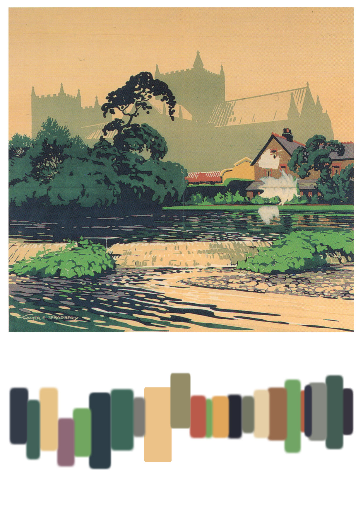
In this workshop brief we were given the task of creating a digital colour stripe that represented the colours in the image well. I wasn’t fully sure exactly how this colour stripe is meant to be created, however I improvised with the notion that the colour stripe should represent the colours from one side of the image to the other and the thickness/length of the individual colour depended on the amount of that specific colour around a specific area. Therefore from applying this idea I have finished with this result. Which in my personal opinion works really well in terms of representing the colours on the image.
To create this piece I used the ‘colour swatch’ tool in Adobe Photoshop and used the colour picking function to select the exact same colours as the image I was working from.
Related articles
- Design Practice 1- Workshop Digital Colour Stripe (kirstyhumphries.wordpress.com)
- Colour Stripes and Colour Theory (emj93.wordpress.com)
- Creating a Colour Stripe. (chelseahoran.wordpress.com)
- Colour (kristalouisejohnson.wordpress.com)
- Digital colour picking (stephsugden.wordpress.com)
- WK4 Outputs/Managing Colour (deavzang.wordpress.com)
- Colour Stripe Experiment (sophiestrain.wordpress.com)
- Making a Colour Stripe (sophiejacksongraphics.wordpress.com)
- Week 6: Using colour Stripes (lukecsingleton.wordpress.com)
- Colour Cheat Sheet! (girlybloguk.wordpress.com)
Colour Test Challenge – SCORE: 0 !
November 11, 2013 § Leave a comment

I was told by my tutor to go on this colour test challenge and to check what score I get. As it would help identify whether or not I had any problems with seeing colours for what they are. Some people have difficulties seeing colour for what they are, as they could be colour blind. I always knew I had a good eye sight, so therefore I was fairly confident with the colour test challenge.
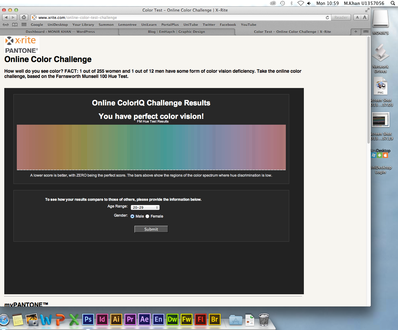
Yeeeeaaaaah! haha! perfect colour vision! happy with the results, especially compared to some of the scores my friends got. My score was zero, meaning that I put all the rainbow colours in perfect order.

The screen shot above is the summary of the results and what these results conclude. In my age group the average score for the people who completed this test is quite high, which is a bad thing because a higher score indicates that the ability to correctly order colours isn’t good.
Related articles
- Colour & Trends – Why is Colour Important? (lydiaharam.wordpress.com)
- Colour blind? (atmine.com)
- Colour Test ! – Thinking and Practise – Module TID1161 (harrietwaudby.wordpress.com)
- Week 6 – Colour (ryanorchardthfc.wordpress.com)
- Colour IQ Test & Results: (itsryanconnelly.wordpress.com)
- Colour test. (dannytaylor94.wordpress.com)
- Colour Test (georgiajanechipchase.wordpress.com)
- Online Colour Test (lauragarside.wordpress.com)
Quick Hair Background Removal Technique
November 11, 2013 § Leave a comment

For this tutorial I was taught how to remove a model with messy hair from one background to another without losing too much thin strands of hair or damaging the image. To do this we used a non destructive method to remove the background from the model.
To start off with, I clicked on the ‘channels’ tab and then looked at the different RGB channels. I then choose the channel with the most contrast and then duplicated it so that I could work on this channel without damaging the original channel layer. Once i’ve duplicated this layer, I then turned the visibility off all the other channels. After which I adjusted the ‘levels’ on the duplicated layer so that the hair strands were more clearly visible.
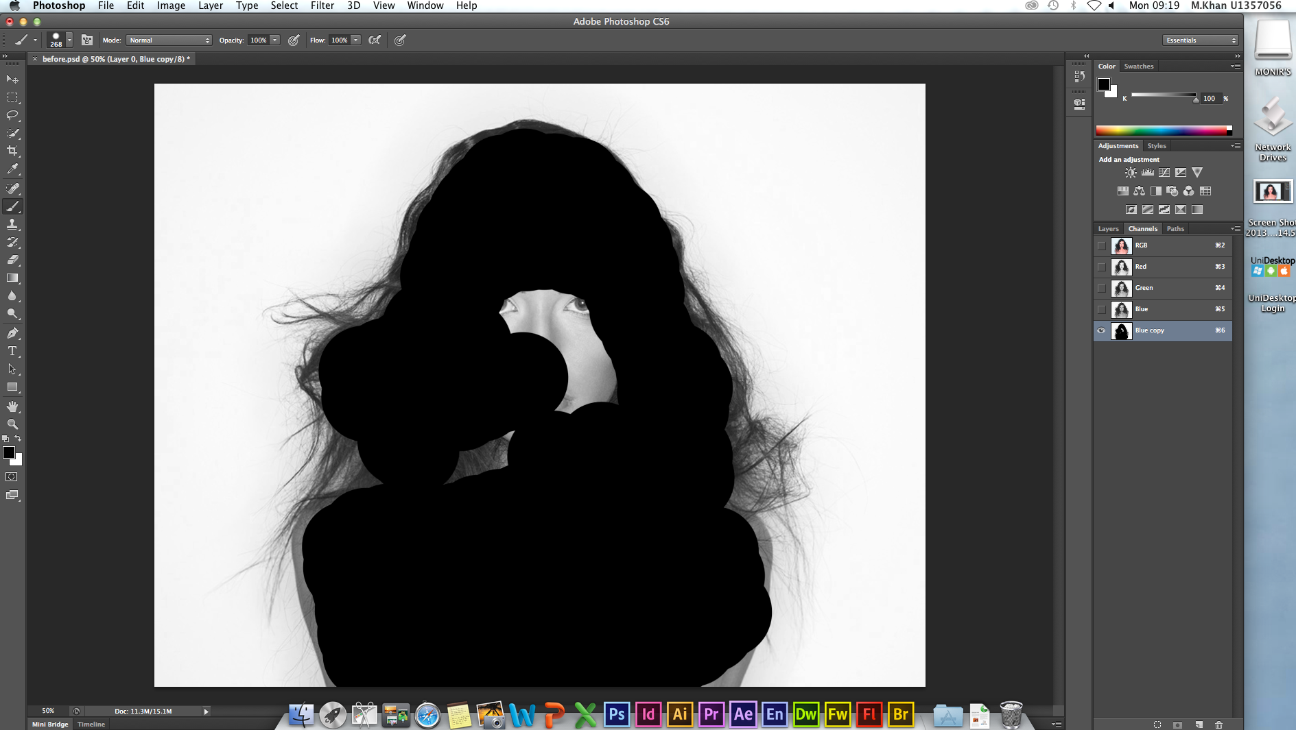
As you can see from the screen shot above, I then selected the paint brush tool whilst the duplicated layer was selected. To which I then started to cover in solid black in the area’s where there was no strands of hair.

I then selected a lighter ‘soft round’ brush with a lowered opacity of around 40%. This was so that I could carefully darken the thin strands of hair, whilst keeping in mind not to over do it by turning it completely black. Once I was happy with results of this process I then went onto the next step of this hair removal technique.
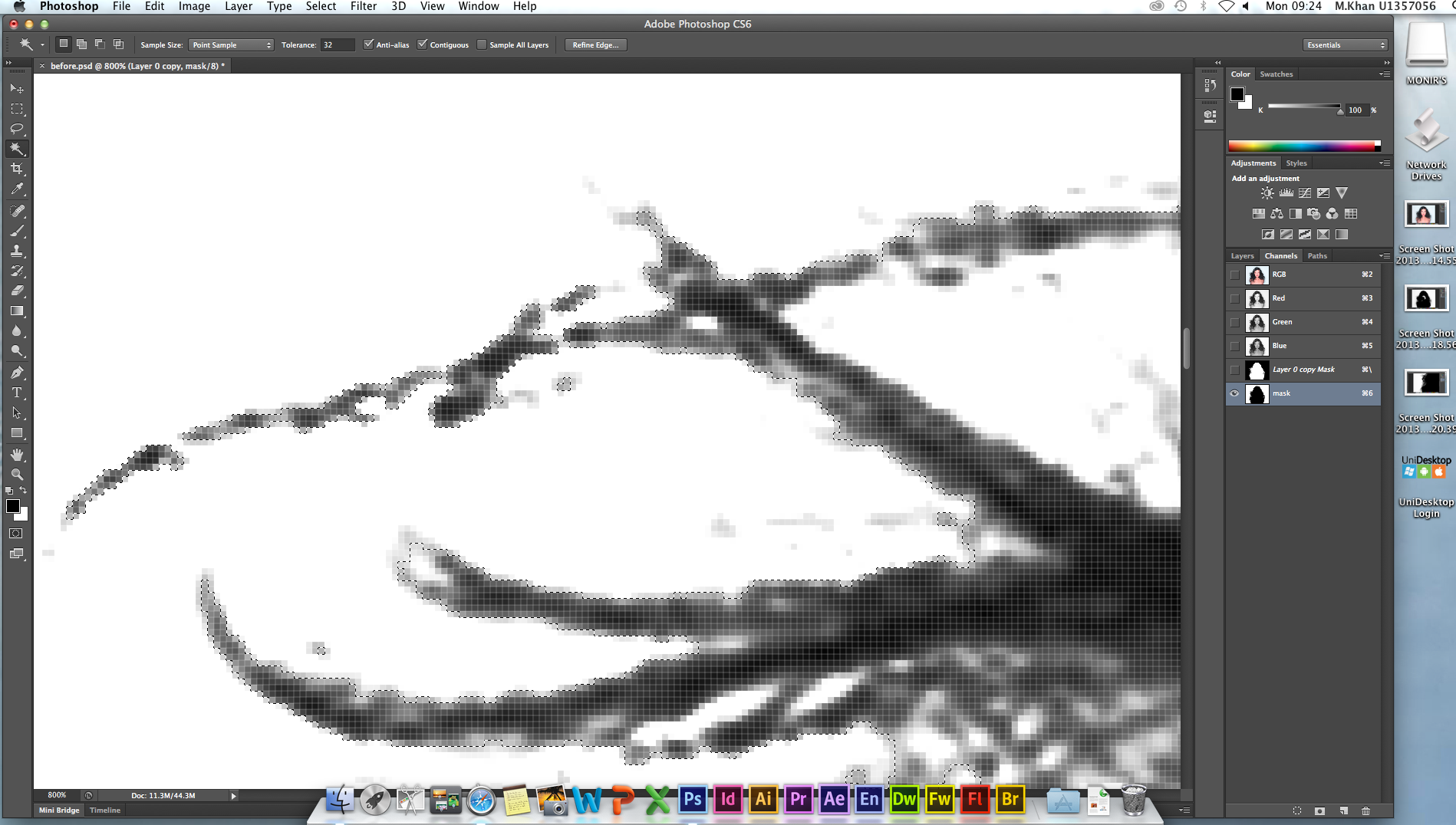
This next step was to hold down the ‘cmd’ button on apples Macintosh and then click on the duplicated channel layer that I just covered in black. By doing this it made selection around the model , including the thin hair strands. I then inverted this selection so that the background would be selected instead by clicking on the select tab and then pressing the invert option.

Once the selection was inverted I pressed the backspace key and this deleted the whole background including the bits around the tiny thin hair strands.

This is the image that I used for the new background of the model. This is so that any imperfections can be easily seen.
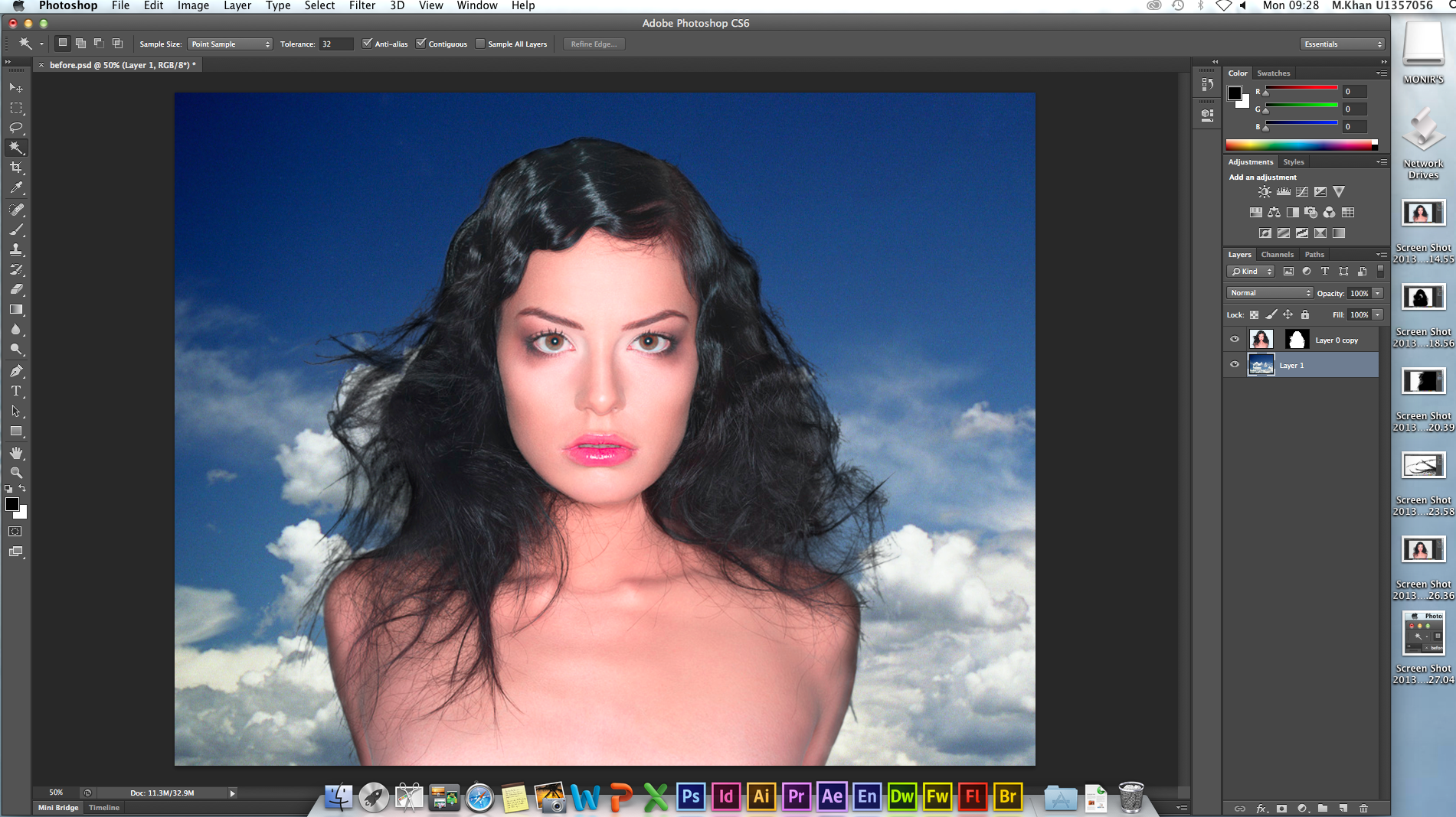
I then dragged the model with the mask that hid the background. After which I had to use the blur tool around the head and hair to smoothly merge the two layers together. In my opinion I think that this method is brilliant. This is because I have previously tried removing the background off a woman with messy hair and this can be time consuming.
Related articles
- Different Hair Removal Options (laser-clinique.com)


Adjusting the RGB colour points considering the subjects skin tone and neutral colour (grey) in the image
November 10, 2013 § Leave a comment
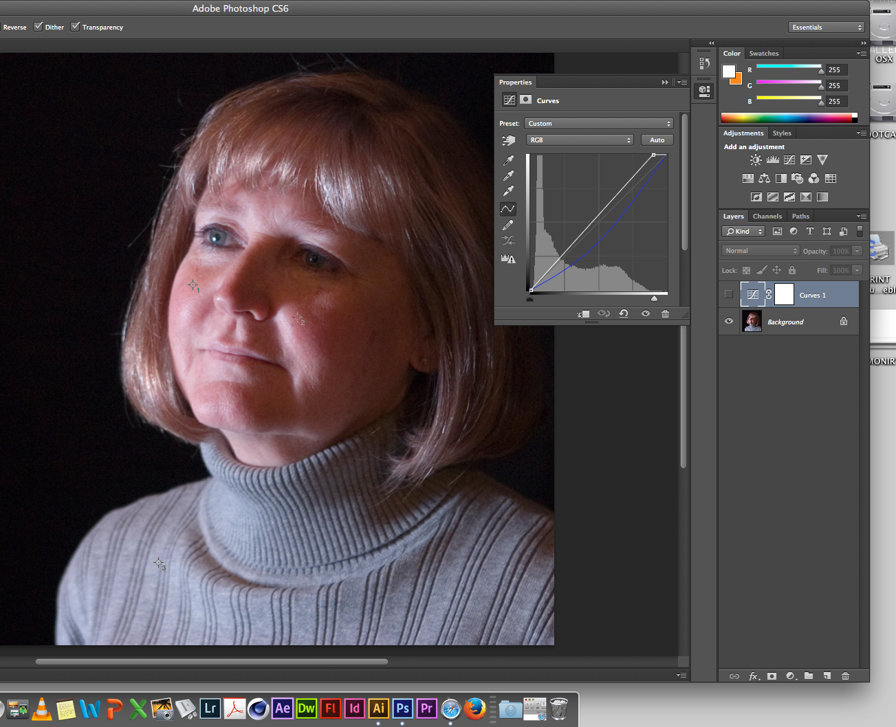
My tutor asked me whether I thought there was anything wrong with the colour of the first screen shots image. I replied “not really” after which he said “in that case you can go home then, because this tutorial argues that there is something wrong with the images colour”. I later found this to be very obvious and shocked that I could not tell at that moment in time. So the tutorial was about colour balancing this image. I started this process by clicking the ‘curves’ option under the ‘adjustment’ tab which allowed me to view the RGB channel numbers. RGB stands for red, green and blue. The curve tool allows us to see how much blue there is in the image. We found there to be too much blue in the image in comparison to the red and green. This is because certain skin tones have RGB numbers that correspond with the skin tone and in this case there was too much blue in this skin tone.

To colour balance this image we must find a neutral colour in the image somewhere, which is a grey colour. This is the reason why Photographers take at least one of their many photo’s with a grey card in the image so that they can later colour balance that style of image.
Therefore our next step was to select three different points in the image, one of them points being in the neutral grey area and the other two in similar skin tone area’s. This allows Photoshop to show RGB numbers that can be compared with the original numbers so that we can indicate whether or not the colour balance in the image is incorrect.
We then entered the correct blue colour number into the ‘curve’ tool so that we have the correct colour balance. As you can see the second screen shot shows much more natural colours, whereas the first screen shots image had too much blue in it.
Related articles
- Tutorial-Adjusting Colour and Balancing Light. (gctgraphics.wordpress.com)
- week 5 colour correction (u1365707.wordpress.com)
- Colour balancing (ryanjwalker94.wordpress.com)
- Colour Balancing Images (katiekershaw.wordpress.com)
- Week 5: Colour Correction (maffuhart.wordpress.com)
- Photoshop Session 6-Colour balance (kirusahota.wordpress.com)
- Colour Balancing (jordanhayton.wordpress.com)
Dark eye bags removal / Blemish removal / Changing eye colour – Using Adobe Photoshop (Ps)
November 10, 2013 § Leave a comment

I started this tutorial by dragging this high quality picture of a person’s face up close.
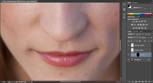
Firstly I removed the blemish off the woman’s face. To do this in a non destructive way where I would permanently damage the original image, I created a new layer called ‘blemish removal’ in which I selected the ‘spot healing brush’ tool. Ensuring that the ‘content aware’ option was selected as well as the ‘sample all layers’ option. This was so that Photoshop would use the contents of all the layers to detect any spots and then heal them spots when clicked on top of them with the mouse.
![]()
I then created another layer, this time naming the layer ‘dark eye removal’ which was exactly what I did next. For this I selected the ‘Clone stamp’ tool, after which I zoomed into the face more so I could see more closely the areas that I needed to work on, also considering not to over do it so that it looks unnatural. Therefore to use this tool I had to hold down the ‘Alt’ key and select a shade of skin tone that I wanted to clone and use to remove the dark eye bags. To do this I clicked and dragged over the dark areas using a low opacity level so that I could blend the two different skin tones in better, which was similar to using the paint brush tool.

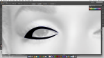
I was then taught how to change the eye colour. To do this I selected the background layer which is the woman’s face. Ensuring that the workspace is set to ‘essentials’ I clicked on the ‘curves’ option which is under the ‘adjustment’ tab options. This ‘curve’ option tool is better to use to change the eye colour because this option creates a mask around the ‘curve’ effect. This means that white colour on the mask reveals the ‘curve’ effect and black covers the ‘curve’ effect. So therefore I changed the RGB on the ‘curve’ tool to just show the blue and then moved the line so that there was a strong blue colour. I then specifically selected the mask and then used the ‘bucket’ tool to fill the whole mask in black colour so that nothing reveals. After which I selected the ‘eraser’ tool and chose a ‘soft round’ brush to rub out the area of the eye, ensuring that the ‘opacity’ percentage is low so that I could reveal the blue colour more smoothly. Looking at the screen shot above you can see the difference in the eye colour and the small white dot in black mask on the ‘curve’ effect layer.

This was the final outcome of the whole process. her face looks much more cleaner than before with less spots on her face, less darkness under her eye lids and also a whole different eye colour entirely.
Related articles
- Photoshop session – airbrushing (matthewsgraphicsblog.wordpress.com)
- Photoshop: Portrait Clean-up (andrewedwardfish.wordpress.com)
- Reindeer’s eye colour rings the changes (thetimes.co.uk)
- Colour correcting photographs (amylowerydesign.wordpress.com)
- Photoshop Tutorial – Basic Edit/Airbrushing (sophiestrain.wordpress.com)
- Adobe Photoshop Glamour Retouching Service Provider (colorexperts1.wordpress.com)
- Tutorial- Airbrushing (kirstyhumphries.wordpress.com)
Adding colour to sketches using Adobe Illustrator (Ai)
November 9, 2013 § Leave a comment

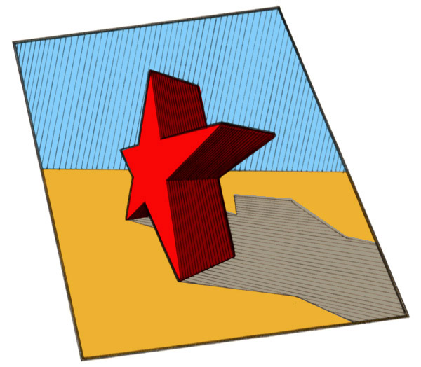
This another sketch that I’ve added colour too, except this time using Adobe Illustrator (Ai). Firstly I dragged the sketch into Illustrator and then selecting the ‘pen’ tool. I then made a path around two stars by clicking on different points in the star and drawing around it. I then created a new layer where this path shape would be placed in. To do this I made selection to the path that I created and then used the bucket tool to fill in the area, as you can see below I selected the colour red to do this from the ‘swatch’ tool.
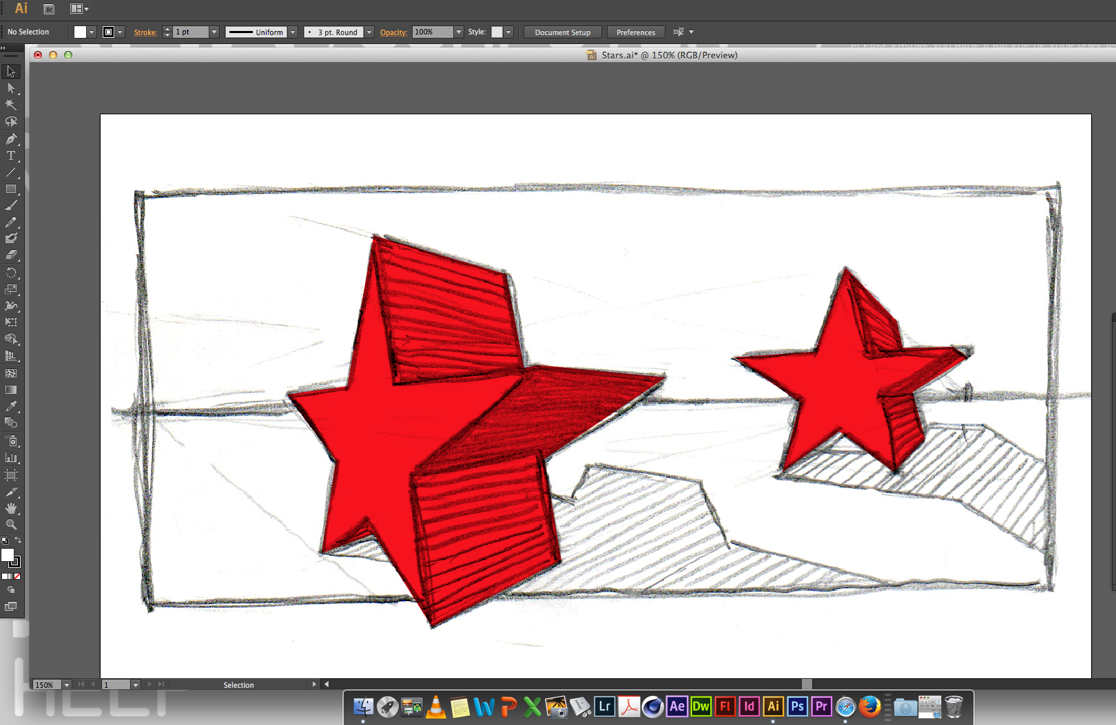
Now I used that same path selection to create a ‘stroke’ line of the star in a new layer. This has given the star a bold outline.

In this stage I used the same ‘pen’ tool to create a ‘path’ around the top half of the sketch and filling this selection in on a new layer with light blue using the ‘bucket’ tool.

I have used the exact same process to fill in the yellow sand area. Also if you’ve noticed i’ve put a ‘stroke’ line around the whole sketch to give it a border.

Lastly to finish off with finishing touches to this tutorial, I made selection to the shadow area and filled it with the ‘bucket’ in purple in a layer. After which I used the ‘multiply’ effect to create a dark shadow. Finally to finish it off I made a ‘path’ selection around the face of the two stars and filled them with the ‘bucket’ tool in a hot pink colour. This was so that the stars had a definitive face and also more depth in their colours.
Related articles
- Creative Suite: Adobe Illustrator (pennymitchell1310493.wordpress.com)
- How to Draw A Triangle in Adobe Illustrator CS6 (kaypublique.com)
- Adobe Illustrator and using After Effects (abbielizabethbeach.wordpress.com)
- adobe illustrator (callans13.wordpress.com)
- Adobe Illustrator (youngb13.wordpress.com)
- Illustrator Sketch Project (nicoledig.wordpress.com)
- Adobe Illustrator (lxsg7776.wordpress.com)
- Illustrator: Adding Colour (andrewedwardfish.wordpress.com)
Non destructive background removal
November 8, 2013 § Leave a comment
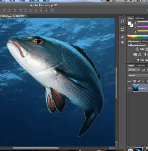
I dragged this image into Adobe Photoshop CC and then used the ‘Pen tool’ to mark around the shape of the fish.
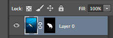
Once completed I made selection of the ‘Pen tool’ and then used the ‘Path’ tool to create a mask of the shape I selected. This is so that the removal of the background is non destructive.

As you can see the background seems as though it has been fully taken out, however the background is still there. For any reasons, such as if I had made a mistake or required to use part of the background; I could simply select the white colour by pressing ‘Command and x’ to change from black and start colouring back in the parts that I needed. This is because white reveals and black covers in the ‘Mask’ tool technique.

This is the image that I have selected to be the background of where I will place both of the fish with the removed backgrounds.
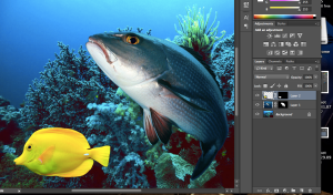
Here I have dragged both of the edited fish images with the removed backgrounds into the selected background image. As you can see both of the images still have the original background with them, but cant be seen because of the ‘Mask tool’. This whole piece of work is non destructive and therefore can be returned to its original state at any time.

This is the final outcome.
Related articles
- Photoshop: Pen tool- Latte Box (andrewedwardfish.wordpress.com)
- Image Masking (cardsharpgraphics.wordpress.com)
ADDING COLOUR AND DEPTH TO DRAWINGS
November 1, 2013 § Leave a comment

I dragged this star sketch into Photoshop CC. I then selected this layer, always making sure that this was the top layer whilst the ‘multiply’ tool was applied.
I then used the ‘Polygon Lasoo tool’ to go around the shape of the star and the area that I wanted to fill with colour. I then selected the colour I wanted from the colour swatch and filled the selected area with the ‘Bucket tool.

Using the ‘pen and path’ tool I drew around and made selection, I then filled the area with light blue colour.
Creating this piece of work has helped me to learn that I can quickly add colour and depth to my sketches on Photoshop CC, with a clean and professional look.
Street Graphics/ Narrative – Mind Map
October 10, 2013 § Leave a comment

These are the words that I have brain stormed from my mind map, I think that there is quite a broad range of words that associate with the theme of street graphics.


You must be logged in to post a comment.